Harnessing Data to Boost Your Social Impact
Did you know that visual information plays a dominant role in human perception and cognition, as it is processed much faster and more effectively by the brain than other types of information (https://www.t-sciences.com)? That’s why data visualization is so important for advocacy. People around the world are rallying toward a new era of advocacy: one that is backed by data and fueled by real-life experiences. There is a growing demand for the power of data gathering, analysis, and visualization. Prioritizing data for decision-making builds the technical capacity of rights-focused organizations and networks to engage with relevant authorities leveraging on accurate and reliable evidence to make the case for causes they are passionate about. As advocates for change, harnessing the capabilities of data can propel your initiatives to new heights.
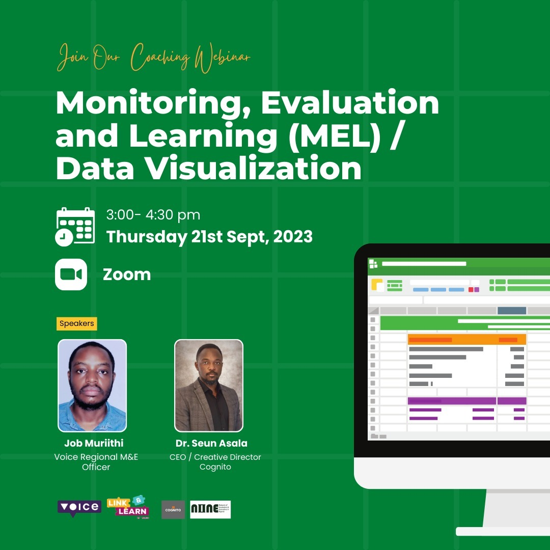
Our September virtual coaching session was focused on Monitoring, Evaluation, Learning/ Data Visualization graciously facilitated by @Job Muriithi @Voice Regional M&E Officer and Seun Asala CEO/Creative Director of @cognito. Here are some reflections from the session.
A screenshot of the virtual coaching session showing some participants
Firstly, understanding the type of data you’re collecting is essential when it comes to data gathering, analysis and decision-making. Data can be broadly categorized into two types: quantitative and qualitative. Quantitative data involves data that can be quantified, counted, or measured, making it amenable to statistical analysis. On the other hand, qualitative data consists of words, descriptions, narratives, and non-numeric information. It delves into the richness of human experiences, opinions, and stories, often collected through interviews, open-ended questions, or focus groups. Understanding this distinction is crucial because it guides your approach to interpreting and presenting the data. For quantitative data, tools like MS Excel, SPSS, R, and Python are valuable companions, simplifying statistical analyses and generating insights. Meanwhile, for qualitative data, software like NVivo and Atlas.ti aids in organizing and uncovering patterns within narratives.
Secondly, the bridge between data analysis and decision-making is how well the collected data has been interpreted. Data interpretation is the art of making sense of the insights gained from your analysis and translating them into actionable recommendations. It involves understanding the story your data tells. It can lead to data-driven advocacy, where your decisions are grounded in solid evidence and facts, rather than intuition or assumptions. This approach brings certain advantages, including reduced risks, enabling quick adaptation, and promoting transparency and accountability.
Thirdly, It is important to note that involving stakeholders, especially the affected communities, is essential throughout the data collection and analysis process. Empowering communities in data-driven decision-making is critical. This entails ensuring “data democracy,” where everyone is involved and no group is left behind. Communities should feel ownership of the data and decisions that are made based on that data. ‘Community ownership’ can be cultivated by involving the community through all the process of data collection, monitoring, evaluation and evantual use of the data.
Data Visualization is the graphical representation of information and data. It is both an art and a science, aiming to communicate information clearly and effectively. It enhances transparency, answers questions, and aids in discovering trends within data. Presenting data effectively is about communicating the story it tells, which can vary significantly based on your audience, available communication tools, and the type of data being presented.
When visualizing data, set clear goals, use accurate data, keep visualizations simple, and select the right charts or graphs. While various data visualization tools are available, understanding the fundamentals is vital: storytelling, and effective communication.
Finally, data analysis and visualization can help you upscale your interventions by providing evidence-based solutions, engaging your audience, and empowering your community. However, you should also be aware of the external factors that can affect your data and decisions over time. Economic shifts, societal events, or crises like the COVID-19 pandemic can disrupt your original plans. To address this, identify external factors, analyze their impact on your data, reevaluate your decisions, and monitor your outcomes regularly. Remember, data is not just numbers or words; it is also about articulating stories that can change the world.
Find the recording of the coaching session here.
#MEL #Voice #datavisualization #coaching #linking&learning #knowledgemanagement

Comments
No Comment available!